I completed 10…no 11 or was it 12…cards with Scrapping For Less’s May card kit, ”Countryside”, and I still have backgrounds stamped and critters colored….and I don’t think I have even touched the tiny check papers yet! Opening the red checked envelope that held this month’s inspiration immediately felt like summer and fair time and childhood memories!
If you haven’t explored a card making kit…I think Scrapping For Less is a good place to start. They always give you four mini kits all based on the theme. This month I found these supplies:
The first photo shows everything that comes in the kit (mine was missing a sheet of black licorice card stock, so it’s not in the photo, but arrived a few days later). The packet on top with the Nuvo drops and burlap ribbon showing was May’s Banana Split option. The other five pics are what’s in each mini kit (one of the kits shows both sides of double sided papers…sorry but I forgot to snap a photo of the other doubled sided paper set).
And here are the cards (so far):
The sentiment balloon was actually printed with something I didn’t particularly like…but there was this sentiment stamp included. Colored it with some distress ink and edged it with my favorite color for distressing the edges…Color Box (Cat’s Eye) chestnut ink. Sparkle tape, ribbon and black and white drops from my stash. I think the white eye is gel pen.

When I saw the jeans pockets I had two thoughts…shorty high pockets and deep pockets. Deep pockets implies a “thanks”…so this card emerged. (Sentiment stamp and white embossing powder from my stash.

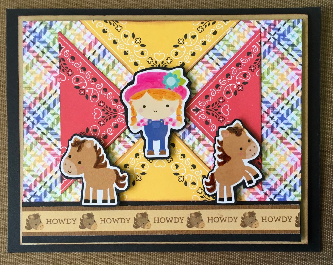
There were some fun neckerchiefs in this kit and fun plaid paper. I created the graphic design background and then wondered what I was going to do with it… Finally deciding to use the “Howdy” sentiment strip and some of the stickers seemed to work. I did punch up the color on the stickers with my Bianyo alcohol markers (which I love!) and distressed all the edges with the same chestnut colored ink. I think the juvenile sticker give a whimsical feeling to this card.
Missing ewe… perfect sentiment…but I decided to use those alphabet stickers (which didn’t stick very well and had to be glued in place). I found a piece of bright polka dot paper in my stash which went well with the plaid paper. In my stash I have a nice rose embossing folder which I thought created a wooly feel to the white card stock, stamped the sheep in Close To My Heart’s Toffee ink…and left one spot empty. Only the sentiment is popped up. The white sparkle tape is also from Close to My Heart. I think this card’s cries out for bold pun inside…like “For flock’s sake call me!” (Thanks Scott! You see what direction you puns are taking me! LOL )

The next card is almost entirely from the kits. Only the sentiment, twine bow, black embossing powder, black sparkle tape, and Nuvo Aquatic Mist glitter drops emerged from my stash. And, of course all edges distressed with chestnut colored ink. This card is popped a couple of times. If I remember correctly I used one of the downloadable sketches from the kit web site. The tag had a different sentiment preprinted on the reverse side of the punch out. I covered the “beef” part of the stamp and printed the Farm Fresh with versamark. I really like the “feel” of this card. It would be perfect with a jar homemade pickles or maybe apricot jam.

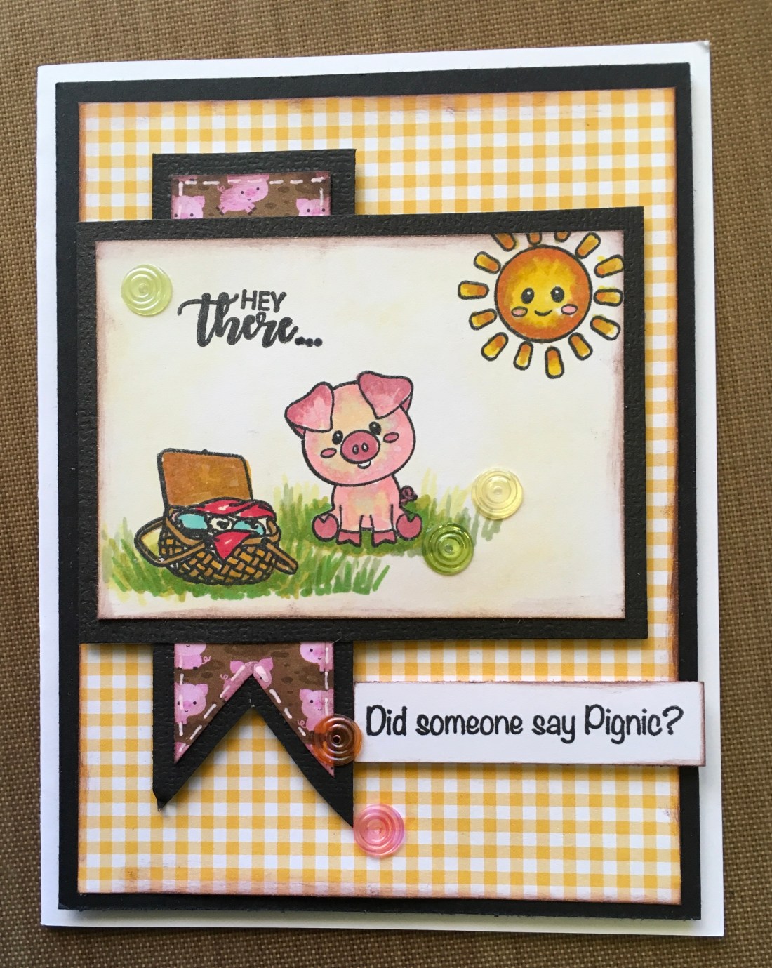
There’s a set of “pig-nic” stamps in one of the mini kits. But, I decided to invite all the animal friend stamps included to picnic. Again, I used one of the sketches from the downloads to create the layout. Stamped the sentiment with Versamark and used white embossing powder. Then I realized I had invited a lot “meat” to my picnic and stamped delicious underneath…so I added a mini sparkle “wink” to one eye of each animal friend. The hearts are Nuvo glitter drops, orange soda I think.

Happy Birthday to Moo! Perfect sentiment! I edged the turquoise cardstock with a border punch by Martha Stewart (I’ve had it for awhile…so it may not be available any longer). The party hat was a quick hand drawn addition. And, of course the mooing choir was inspired by happy cows lined up for milking across America.

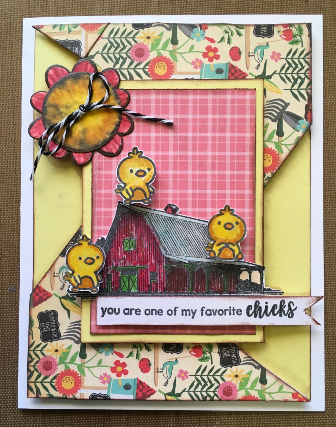
The next card started with that great barn stamp Fine details…and challenging to work with. There is a Farm, Faith, Family, and Friends sentiment above the barn on the stamp. But I think that barn is wonderful and needs to stand alone. I attempted to give the roof a copper glint with the transparent Nuvo drops in the Banana Split option kit…but I found I couldn’t add color to the surface. Tuned one of the preprinted sentiments over for the flower petals, and cut a circle for the center, to create a flower that resembled the sunflowers in the printed paper. Added some chicks to the barn. If you know anyone who raises chickens…unless they are carefully caged they tend to be everywhere. So my chickens are sliding down that barn roof. I’m still playing with that barn. The fine lines require careful coloring and permanent ink that is alcohol friendly. I have blurred several while experimenting with various coloring schemes. You can expect to see again on future layouts. The sketch I used was from a 2017 download on the web site.
Back to the Pignic. I love the stamp set and used it several times. The “Hey There” is from my stash…used when I temporarily mislaid the “Hay There” that was included in the kit. Still cute though!
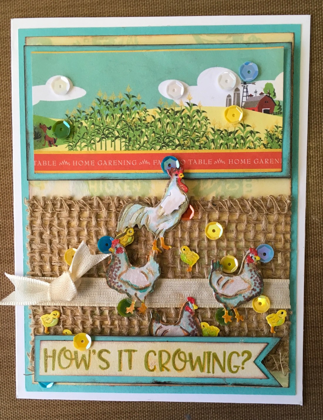
I wanted to use the die set that came with the Banana Split kit option, and also a piece of that great burlap ribbon. The printed sentiment under the farm says “Home Gardening~Farm to Table”. Cute for the farm paper layout. But…there was this one ephemeral sentiment…”How’s It Growing”. With a little white gel pen and some blended Scattered Straw oxide ink…that sentiment became “How’s it Crowing”…which went much better with my rooster, hens and chicks theme. Added quite a few sequins, but I loved the way they moved the eye around this card.
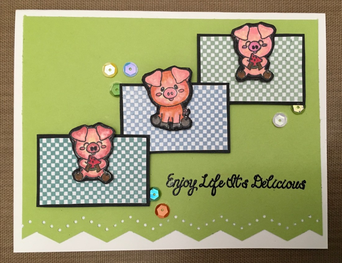
So…that was 10. And usually I stop at 10 cards from a kit (unless I need a special one for some reason), but I just keep going back to this kit. So, here are two more. Another pignic, using the checked stamp included in the kit. Another Martha Stewart border punch.
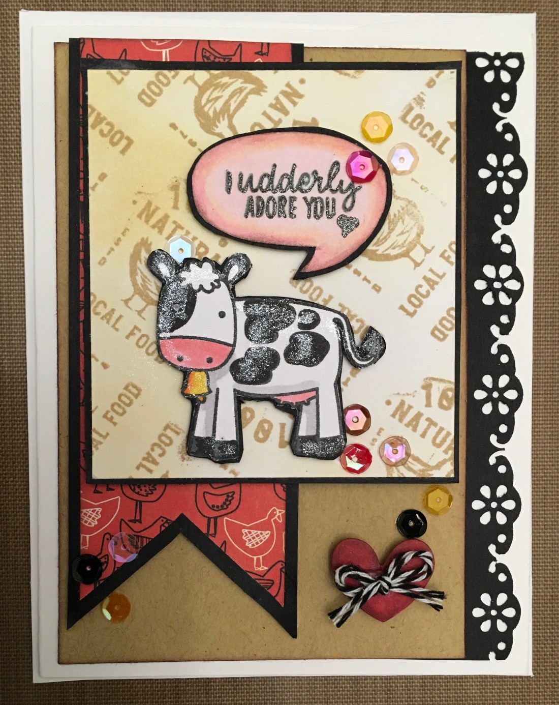
The second card uses one of four stamps that seem kind of like advertising to me. I stamped them with toffee in and blended scattered straw oxide ink. The stamps make great backgrounds. I fussy cut a sentiment balloon and stamped the sentiment from the kit. I did add some sparkle to the cow…which doesn’t photograph well. But, it a fun card!
So, that it’s for now! Keep on creating and my farm farewell pun…
Peas be with ‘til we meet again!