Magpie Supplies

I’ve been planning this card since I first read on Love For Lizi’s blog that the challenge for this month was “Magpie Supplies.  I know that many others have referred to the challenge as “shiny”…but with supplies from the August kit…and maybe a bit from the May kit…I think this card fits both.

4AC26596-4B0E-43D8-8BDF-7C53FD335B2A

And when you remove the slider band…

69B40BA7-3CA8-4599-8F57-7087C03C7A9E

A magpie resting in a nest of gold.  And the sentiment…Made with Love…because why else would a magpie gather all those shiny things if he wasn’t hoping for love.

When it’s monsoon season…make cards!

I’ve been busy making cards and enjoying the almost daily “weather” we’ve had during July and August.  Not as much rain as I’d like…but I do love the clouds, and the thunder and lightening shows.

My Love From Lizi August kit had an unfortunate accident during it’s trip “across the pond”.  So photos of what is in that kit will have to wait until the replacement kit arrives.  I love card challenges though, and the theme this month is “Magpie Supples”.  Magpies love shiny objects…who doesn’t?  So I have rescued a bit of the wonderfully shiny paper in the kit and made a few cards.  The first card for the challenge I decided to use handwritten quote for the sentiment.  It didn’t photograph as I had hoped it would.  So I redid the card, using a printed version of the sentiment.

7DBFA06D-29F4-4073-8029-8D5623DF22A1

The paper is mirrored gold and it’s a lovely paper!   So here is the second version.  As you can see, the printed sentiment reads much better.  As you can see I redid the background using oxide distressed inks, spritzing with water to increase the texture. I also added some of the sequins that came in the kit, and put a single drop of Nuvo gold glitter drops in the center of each for added sparkle and shine.  Since magpies gather shiny things in hope of attracting a mate…I think the Emily Dickinson poem “Hope” is perfect!  The rest of the first verse :  “And sings the tune, without the words, And never stops at all.”

9C124048-409F-4550-8E03-324B0827BD4F

Most of the papers in the damaged kit had a coat of embossing powder, which I could not just wipe away because the gilded papers were so delicate.  There was also tears and hand prints…which leads me to think that someone, perhaps at customs, realized the package was damaged and open it to see what was in it.  I don’t know how else to explain the handprints.  The Nuvo drops in the kit was also damaged…and so there was a great deal of  dried media spread throughout the kit box.   So, the stamps, some of the embellishments and bits and pieces of paper, and card number two appeared.

DB597CC0-377A-48BB-90C3-432FE11C6091

I stamped the beveled star ring is a very nice stamp!  I used rose embossing powder on the popped up ring, and white embossing powder on the rings stamped on the pink card stock.  I added some pink translucent Lizzi pull offs, from the June kit, across the bottom and up the left of the design…and then also to some of the long lines on the white cut out ring.  Next I added vellum to the middle.  I made a small pile of shaped and colorful sequins from my stash, and “caught” them with the foam tape as I popped up the white ring to make a shaker card.  And finally I stamped, and embossed the the sentiment in white.

The next four cards came about during a storm when I was waiting for the power to go out late one night.  I stamped the large Celebrate stamp from the kit, with lavender distressed oxide ink…which was quite pale.  So, it became a series of four, as I layered other colors to see what shades of purple I could develop.  Each color got it own design, developed using the stencil from the kit.
For the first card, I fussy cut the circles from the stencil, adhered them to some black card stock from my stash.  The silver glitter Lizi pull offs were added after the circles and then the circles also received  a line of sparkle.  A popped up the large stamp with foam tape, added a couple of mirror tiles from the kit, and some of the tiny star sequins, and card four was finished.

BC0C71F3-C4FD-45EE-9B3A-E20DD9C0D170

In developing this series.  I actually colored the stencil with the four color variations at the same time I was inking the Celebrate stamp.  When viewing the cards with the eye, the stamp is the same color as the stencil portions.  But, the camera picks up more than the eye…and so you can see color variations.

For card number five, I wanted to use a piece of purple card stock for one of the layers…so I layered the ink until it “looked” like the card stock.  In the photo there is a quite a difference in the color of the ink and the color of card stock.  I also made use of the variation of the sizes of circles on the stencil.  So this card has large or small purple shapes, and the purple card stock, stamped in Hero’s unicorn white,  uses the opposite sizes of circles (large under small, or large over small) depending on what was stamped on the middle layer.   I cut a stitched frame out of silver mirrored card stock from my stash, and some circular stitched embellishments for the middle layer.  I added faux stitching to bottom layer (that was cut with out the benefit of a stitched die), and popped each layer up with foam tape.  Finally, some silver start sequins and silver Lizi pull offs to embellish the large Celebrate stamp and number five was complete.4A16D734-E636-464F-9844-DEA39367C51D

For card number six, I layered the lavender distressed oxide with Hero’s reactive blue.  There are several layers of each color, but the blue being the top color, photographed without much of the lavender showing through.  For this card I rescued a bit of the damaged paper from the kit and colored it to match with the same inks.  I used a stitched frame die to create a mirrored silver frame for the middle layer, and mimicked the  lines from the beveled star stamp with silver Lizi pull offs.  I was able to disguise the most damage area of the dotted paper, but in photographing the finished card, some of the damage was still visible, so I off set the layers.  The Celebrate stamp layer is embellished with more silver pull offs and silver star sequins.  Yes I fell in love with those tiny stars!  I enjoyed the variation of graphic shapes in this series.  This card has repetition of shape, and much more extreme variation of size, as well as the variation in negative space on the embellished paper layer.

9B0583BA-E2D8-4BA5-9A04-1D129C29E78E

Card number seven was so much fun!  I used a piece of the metallic ribbon from the May kit as a stencil to create yet another variation for the background layer.  I varied the frames, using different dies for the two framed layers….each only a half frame…and silver lines running from the frame edge.  On the lower lever there is a pattern area of silver horizontal lines.  On the middle level there is a pattern area of diagonal lines (after all…all good designs include a diagonal line…lol). On the Celebrate stamp layer, the silver lines run around the hexagon, with only the left side framed.  Silver star sequins and stitched edged circles embellish the layers.

160DA2E9-DB23-4E8D-8CD4-E4BF0C3A8B9C

4E6501E3-6C77-4AA5-A994-AE401ED80648

Twinkle, twinkle, little star…Do you know how loved you are?       For card number eight I stamped the star ring three times, and heat embossed them with black.  I started with my softest gray Bianyo alcohol ink pen, adding dimension to the stamped images, and thinking I would make a black, white, and silver card.  The soft gray was not enough color, and very soon the three rings had taken on the color of three of my favorite diamond colors…yellow, blue and pink.  I split the rings to layer them, and embellished them with some translucent Nuvo glitter drops.  A few lines of black glittered Lizi pull offs line the left side and the bottom of the card. One of the silver metal charms floats in the center ring.  I added a few silver star sequins for embellishments.  Twinkle sentiment from the stickers.

It was a lot of fun to explore the graphic properties of the stamp, stencil, and papers.     And while I was typing I received a text saying that my Lizzie kit is at the post office and ready for pick up!  I can’t wait!

Hero Arts July 2018: County Fair

The next card making kit is Hero Arts July 2018.

MMH (My Monthly Hero) is a great kit!  This month it includes three sample ink cubes:  Red Reactive, Blue Reactive, and Unicorn white. This is only my second kit from My Hero Arts, but already the inks that were included in the April kit are some of my favorites!  The July kit includes 10 dies, and a full card size sort of sun burst die, a 6 x 8 set of stamps that includes 11 sentiment (some single words) stamps, a full 5” x 1” background stamp that includes farm and fair/carnival images, a Ferris wheel, roller coaster, merry go round and snack/ticket booth stamps.  Also included an bi-wing airplane pulling a banner, 3 balloons, an hot air balloon, cloud, and fireworks stamps.  There are five border stamps, including a fence, dots, stars, diamonds (or flags?), and a corner with 2 sides . There are 3 extra heavy weight postcards, and of course the 2 sided image board that comes between the dies and stamps.  And its all wrapped and tied with two lengths of ribbon, red and blue.

10E4A11F-8B3B-4AF3-9906-B1D9C6118986

I always think that Hero Arts encourages you to explore your own creative backgrounds…and of course you’ll need to go into your stash for card bases, and other papers, inks, and embellishments (if desired).  So, the gloves are off!  Let’s go and see what kind of cards can be created with this great fair oriented kit!

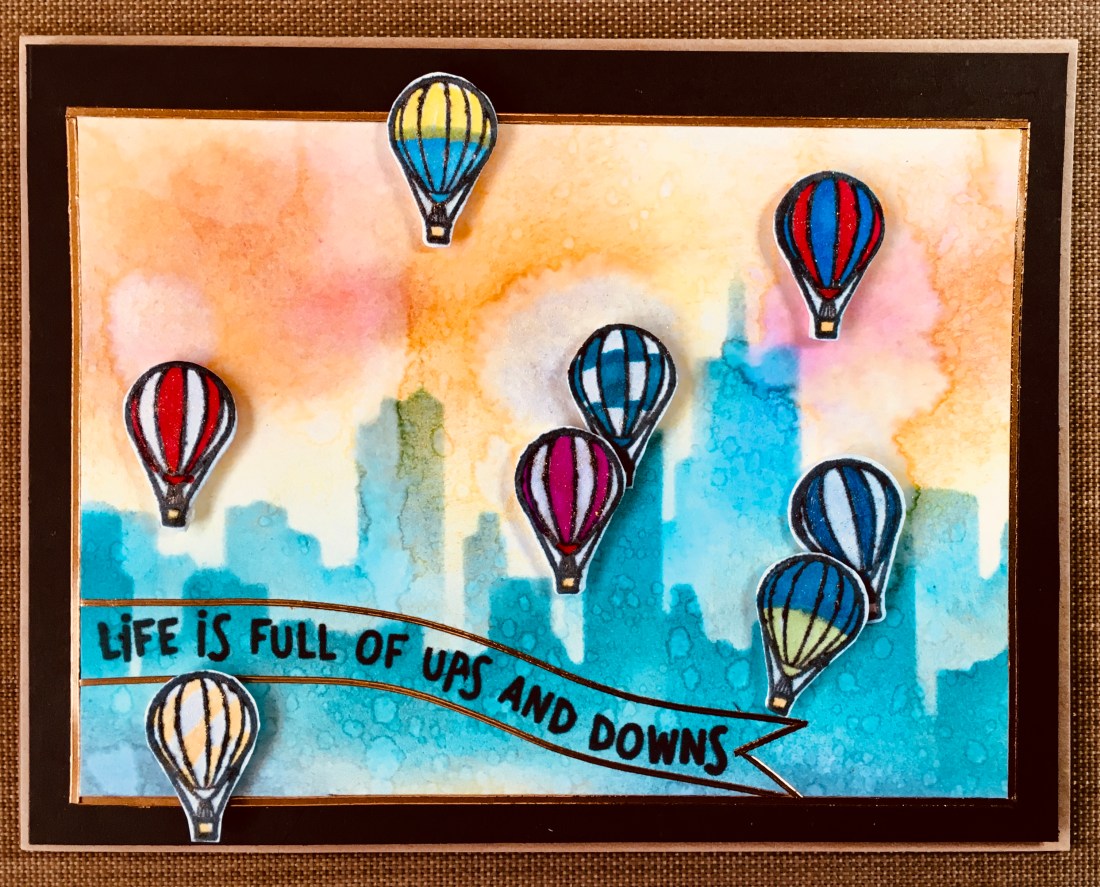
I had so much fun with the hot air balloon images in another kit that I really want to play with the hot air balloon stamp in this kit right away.  I recently allowed myself a stash building shopping binge and one of the items I picked up was Altenew’s City Scene Stencil.  Using the stencil with inks from the April My Hero kit, Fiesta Red, Fiest Blue, and Fiesta Yellow, as well as Altenew’s Crisp Dye Inks (Dew Drops and Sea Breeze),  I created this background (which has also been spritzed with water for the reactive textures).

77B11667-717E-4E30-84B7-2CC847C0206A

You can see a few of the hot air balloons created with stamp and die cut from the kit, colored with Bic ultra fine markers and metallic gel pens.  I stamped a sentiment from Lawn Fawn’s Coaster Critter (LF1694) stamp set which says “Life is full of ups and downs” and is similar to the MMH stamp in the kit which says “I’m here for you through ups and downs”.  I like both sentiments…but felt like the Lawn Fawn sentiment went better with the hot air balloon theme.  For bells and whistles I used some copper pin-stripe stickers from Love From Lizi ( I love them and I think they may be exclusive with Love From Lizi…or at least I have not found them elsewhere) to create a thin border around the background image and to create a banner effect around the sentiment. I mounted the background image on brown cardstock from my stash, popped it all up on a natural card base from Darcie (in keeping with the natural color of the post cards included with the kit).  Next I popped up the balloons with foam tape and gave all the balloons a bit of shine with gold shimmer pens from Close to My Heart.  And card number 1 is finished.

00C34A9D-27D5-46DB-9398-DADD455A713C

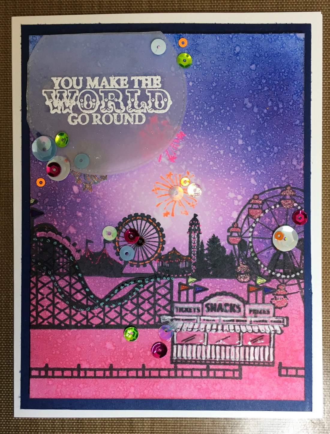
The inks that came in this month’s kit, Reactive Red, Reactive Blue, and Unicorn White are fun colors for patriotic holidays and months.  So I next decided to play with only those three colors and see what kind of a background I could come up with.

051CAA58-4606-42EC-8954-6585A338EBB8

Very nice ink colors to work with.  The Reactive Red leans more towards a hot pink (there’s a watercolor called ‘Opera’ that strongly resembles Reactive Red).  The inks blend beautifully, and the unicorn white ink sits nicely on top or blends in .  And all three are reactive, as you will see when you look at the finished card.  Also the kit is full of fun stamps.  So, for this card I decided to use several of the stamps and create an evening at the fair card.  I blended the three inks that came in the kit, and spritzed the entire background with water.  I stamped the long narrow background fair stamp, and then tried to stamp the fire works.  I wasn’t impressed with lack of “pop” on my fireworks until I used fluorescent gel pen to trace the stamps.  To continue the effect, I used the gel  pens to create lights that lit up the fair structures.  Then I carefully stamped the roller coaster, the Ferris wheel and the snack shop/ticket booth…trying to create a sense of space within the “picture” frame, and also mindful that the background stamp was visible through the larger stamped images in the foreground.  I once again put my gel pens to work, and even added some Nuvo translucent drops to the windows in the snack shop/ticket booth.  Stamped the sentiment in unicorn white on a piece of vellum cut with a stitched circle die, and embossed it with white.  To finish up the sparkling fireworks effect, I added plenty of sparkly sequins.  I popped it up with foam tape on a dark blue, and adhered it to a white card base.  And that completes card number two.

B5D17716-5E2C-4EFE-84FC-57B88F884149

And so on to card three… I wanted to use that great background die that came in the kit and went to my stash for some interesting papers that would allow me to use both the positive and the negative shapes created by the die.  I found some rose gold glitter paper, and a piece of rose gold corrugated paper.  This meant that card three actually became four card bases.

84487943-D82C-4A57-92AA-C21FBC5C87E8

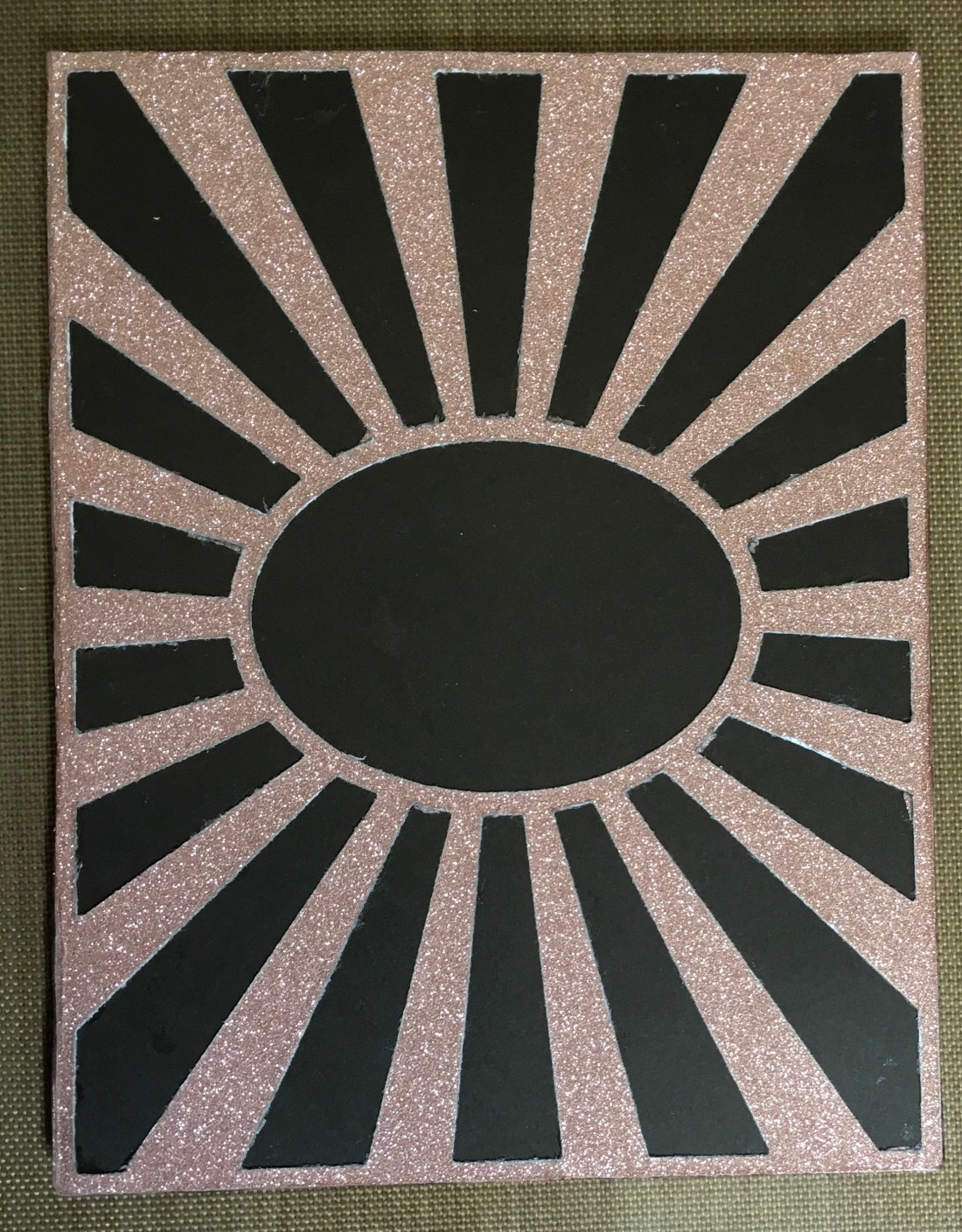
The rose gold glitter paper did not cut well.  I ran it through my big shot many times, rotating it each time…and finally ended up using my craft blade to finish cutting it out.  Unfortunately, the multiple attempts to die cut it, let the edges a bit ragged.  But, it still looks very nice on a dark brown piece of card stock.  Above is the positive, below is the negative cut out pieces adhered to another piece of dark brown card stock.

526AB049-1FE5-4F64-AD1E-105D314A2302

Again you can see some rough die cut edges…but the rose gold is such a lovely paper I decided to go ahead and see what I could make with it.

(At this point I realized I had taken these photos with “True Tone” turned on…which is not a good thing to do to photos…I’ll try to remember to redo them!)

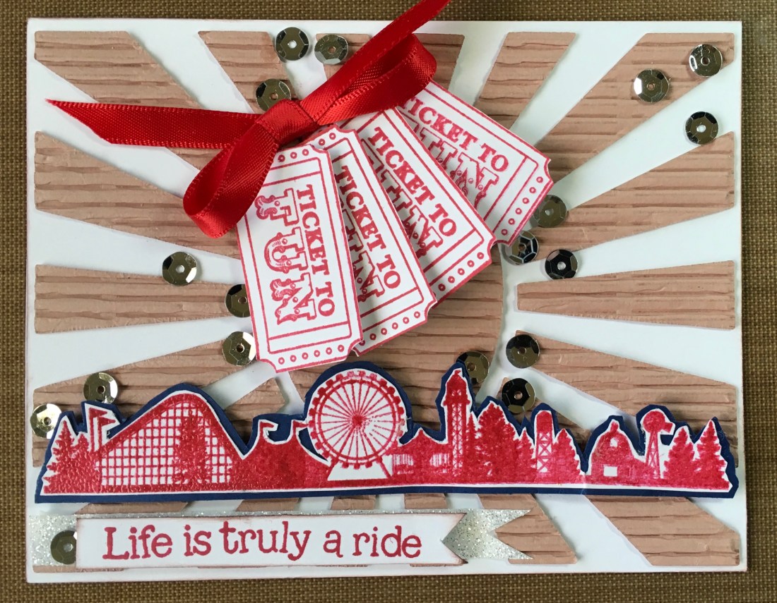
Card number 3 uses the positive die cut section (you can see the burst piece are all connected on the outer edge, and the center oval is cut out).  For this card I stamped the tickets to fun in Adobe.  My initial intention was to use them for a border piece.  But I decided they didn’t “fit” with the radiating sunburst effect.  I next cut a tag from the rose gold corrugated paper and tied a double bow with the red and blue ribbon that came in the kit.  I added the tickets and payed it on an angle over the center cutout area.  (I’m not sure the photo does it justice…this is really a striking effect..)  With tickets…you need rides.  I stamped the border scene in Unicorn White, and embossed it clear embossing powder.  The resulting color is very “cool”, where the rest of the elements have a “warm” tint.  This has the effect of moving the viewers eye from the ribbon and tickets to the scenery, and then back up.  As I studied this card, I decided the effect I was creating was one of “big dreams” for a visit to the fair…so I needed to add something to help the eye move “around” the picture plane, rather than bouncing up and down.  I had some rather large star sequins in my stash and laid a few on the card and liked it right away.  So, card number three was complete.

F6D2944C-9352-496F-B2AF-81D959197B52

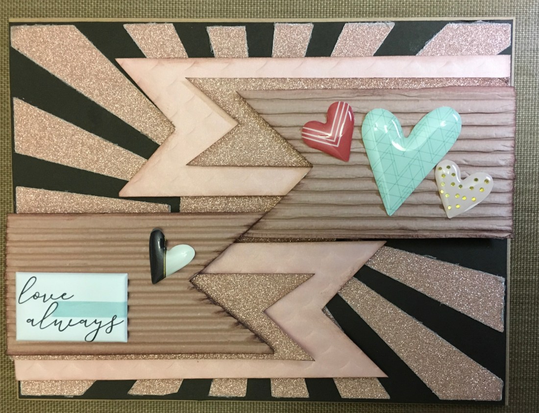
Now for card number four.  I had all those fun rose gold papers to consider, and I liked using the sunburst for an abstract background.   So, I cut three banners of different lengths and laid them on the top right side of the card base.  Next I looked through my stash to see if any of my sentiments would fit the evolving card.  I picked up a sheet of puffy plastic stickers.  I’m not really a sticker on cards person…but I do try to use items in my stash and items that come in the kits.  I liked the banners on the card base….but I didn’t like the half of an oval center .  So I cut a second set of banners and laid them on the card base with the “love always” puffy sticker sentiment.  It was starting to feel like a hug…but the puffy heart stickers just didn’t have enough sparkle.  So back to my stash and found a few “puffy” looking enameled heart stickers.  Perfect.  Again….there’s a lot of texture in this card, and the real thing looks much better than the photographed image.

413621EA-B333-45D7-887F-38C83B65AE13

I still had the two corrugated backgrounds to use. The next card was fairly simply.  I printed for tickets using the reactive red ink and popped them up, one layer of foam at the base, and two layers near the fanned and lifted edges. I used some of the red ribbon to tie a bow, and added it to the card.  I was trying for an all red and white card, so printed the fair border in the reactive red and embossed it with clear embossing powder.  When I added it to the card, it seemed a bit lost, so I backed it with some dark blue cardstock and fussy cut around it.  The sentiment is from my stash, but only because I liked the juvenile feel of the font.  After all, anytime I’ve attended a fair I was either a juvenile myself or was taking one to ride the rides. I did add a bit white shimmer tape, and some silver sequins for a bit of shine.


D0E4222B-4B06-4E67-8C60-4A0FC30A309C

I thought my fair ideas were beginning to feel stretched…so I decided to see  what else I had in my stash…after allI still have that great background die.  I found several combinations and created card bases.

Yes, I did take them outside to photograph them…and yes that is pine tree reflection winking at you from the mirrored card stock.  I put these away to be used at a future time.  And thought I might try a “spinner” card for my next county fair themed card.

95BC3958-7FE2-48C4-B003-63AFE29BDECE

I may yet redo this card. When it began, I was building a maze for an “you’re amazing card.  Then, when I photographed it I realized my stamping was not as straight as I thought.  It’s a fun little spinner card and the sentiment inside will definitely say “You Make My World Go ‘Round!”

One of the reasons I got started designing my own cards was because I am never happy with purchased cards.  And in making some of the cards in this set…I had the same feeling.  So I started the next card with a bit of “sentiment” research.  I found a nice bit of phrase with no author attached, and set out to create an ‘empty field’ feeling background using distressed oxides.  I used printed the sentiment on vellum and mounted it to my “field” background.  Next I used Spellbinders’s card maker “You Are My Sunshine” and cut a frame out of red card stock.  I used a bit of Nuvo drops…and decided I like the verse more than the card and started over.  And created the kind of card I am more comfortable with.  A bit of shine, a bit of class, as it is black, white and silver, and a very nice verse.

DFAA014A-F6B9-4B72-8C32-930E657A2CA2

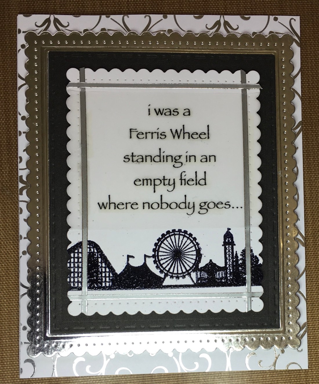
I really liked the results.  I did go into my stash for some silver foiled patterned paper and card stock, I printed the fair border scene with versified ink and used black embossing powder.  I used Spellbinders’s Fancy Edged Rectangles to create the frames, and Love From Lizi’s silver adhesive lines.  The verse was printed on vellum using my printer.  I actually think this would make a nice anniversary card.  The verse certainly indicates that there was a time before now, so I think I’m just going to leave the inside blank for now.

My fair affair may have run it course.  I tucked all those sparkly card bases away, and looked longingly at my next box, full of cards just waiting to be designed.  I hope something here has inspired your own card designs.  And I’ll see you soon with more  card crafting ideas!


Work that Stash!

Hello my crafting friends!

Did I mention that there are fur babies at my house?  Mini poodles, Coco and Nico.  Coco, having been an only poodle for several years, prances through life…literally.  She was born with wisdom and grace.  She rules the roost with just a glance.  And if anyone misunderstands her plans for the day, a snort of derision reigns them in.

Not so Nico.  Nico is the son of a European immigrant champion.  And he was born to  perform and run.  We deal with his enthusiasm for life by going outside several times and day and just saying “run, Baby, run”.  And he does.  At first it was just back and forth across the yard.  But no more.  We forgot to build him a performance track, so he is designing it himself.  He has added great long leaps, figure eights around the garden, up stairs, down stairs, under trees, around vehicles…and of course a brief refreshment stop at his favorite fountain.  And he runs like the wind.  Some days the game changes and he expects to be tagged as he passes, but most of the time he races around his obstacle course and looks for ways to make it more complicated.  There are days I fear we have done him a disservice expecting him to just be part of a family, when he is so obviously a performer.  But he loves us all so much and is so pleased that we are here,  And if ever I have quiet crafting to distract me from his games he lays quietly with his head on my foot until I’m ready to play again.

Enough about puppies!

What to do on a day between deliveries, when all the obvious cards have been designed and created… Work your stash!

You’ve got dies, inks, papers and creativity…and what you want to do wait for that box of new inspiration…  but it’s held up at customs.

So look for a left over like this and let it inspire you.

4106E9D8-F0D1-4DD1-AD31-06BB94166D61

Actually it was a 6 x 6 when I started.  I still not sure what those organic looking bumps should be, so I turned to my sentiments.  Sometime a few words can lead to an idea.

In my puffy sticker collection I ”discovered” a small sentiment that simply said ‘off the beaten road’.  I looked at those bumps residing on their curving lines and by Jove!  They could be trees and not minions… So, I cut out a few segments along the long lines… Interesting.  But with no coordinating background or focal point I knew something was needed and decided to pull out my reactive distressed oxide inks.

(I know, I know…I need to learn to do instructive videos…)

Using my blending tool I spread color across a  5 1/2 x 4 1/4 piece of card stock.  Then I spritzed it water, and waited until I saw the magic happening, dried it quickly with a paper towel and laid it next to  stash paper.  I traced some of the curving lines onto the died paper and cut several sections.  I rearranged them until a found a pattern I liked, and adhered it all to a card base.  Next I stamped a sentiment, which I mounted on black card stock and popped up with foam tape, added a couple more puffy stickers that repeated the background shapes and three black dot embellishments… And, of course, added that puffy sticker “off the beaten road”.  Et voila…a fun “missing you” card was complete.

81B6FD92-3857-476B-9928-8DC72A6C1E3F

I continued working my stash and found that stamping tone on tone flowers and leaves made a nice background that tied a geometric designed paper to a sheet of paper printed with books and plants.  In my stash I also had a sheet of short phrases that looked like they had been tacked on a bulletin board.  They fit the book theme nicely.  I distressed all the edges of the elements I was preparing for this card, used my alcohol markers to enhance the colors of the “tape” on the phrases and added some Nuvo drop “tacks”.  Popping all the elements up with foam tape really gave a nice dimensional look to this card.  I created a sentiment with puffy stamps and stamped the word “are” to tie the words together. Adding a few more Nuvo drops to geometric design helped move the eye around, and card two from my stash was completed.

050C41BE-6250-470E-9925-AB4508E1B316

Next I pulled out an orange card base and laid it in the midst of the stash papers I had selected.  I suppose somewhere in me is a bit of the art instructor still saying ”add a diagonal line to every design,” and it showed as I continued creating cards.  I found I really liked the turquoise and orange color contrast.  I used tone on tone, and color contrast (orange on white) .  I added a sheer white ribbon and bow to one card…but when I photographed it the camera really enhanced the shadows.

So that’s five cards from my stash!  Orange you glad I’m done for today?

Still Looking Back…

I had such a fun creative  month and I really don’t want you to miss any  of it!  Look at all the goodies in the June card kit from Simon Says Stamp.  The floral stamp is a nice large 6 X 8 size.  Yes that’s a sampling of Daniel Smith watercolors, a Sizzix  embossing folder, card stock, 6 X 6 patterned papers, a preprinted watercolor card base.  And don’t forget the sweet treat!598C2064-6C0A-4606-A2EE-6F0C0AE9FC3A

I fell in love with this card kit as soon as I opened it!  I enjoy being able to make a variety of cards…such as  a greeting card, a sympathy card, an inspirational card, a birthday card…so this kit was perfect for me!  In this first card I punched up the color of the nearest ballon to give a real sense of depth to the image.  The row houses have a bit of color enhancement and a bit of layering and “popping up” of the nearest row of houses.  And I let them extend out of the picture frame to express contin

04319EE8-C952-46B6-9474-18CB49A6A289

The color of flowers in the following card have been punched up a bit with alcohol markers.  The “you” was cut with a die from my stash.  I used three cutouts to give it some strength and dimension.  I used chestnut ink to distress the edges a bit, and added a piece of green burlap ribbon from my stash.  This lovely card could be used to lift someone’s spirits or it could be a special occasion card.  67359F30-4B94-4B62-AAB5-CEBDA2EE009D

The two next cards were created at the same time.  I used prism colored pencils to color the stamped floral arrangement on the white card stock.  I used Daisy white by CTMH to print the same floral design onto blue card stock.  Carefully cutting both designs, I matched them up and adhered them to card bases, added a green burlap ribbon, and embossed the sentiment in gold.

The next coloring with alcohol markers and colored pencil caused a bit of a halo around a couple of the flowers I had stamped on the a printed paper…but I didn’t mind the effect!  The edges are distressed with chestnut ink.   I added a twine bow (it reminds me of hug) and popped the whole card up on a card base from my stash.

B2F33510-8356-425B-AB7B-70AC1B4B4C75

The following sympathy card was created by embossing first black card stock in the embossing folder, then adding gold embossing powder and heat setting it.  Then I cut out just the one flower and adhered it to a vertices line of black shimmer tape from my stash) onto an embossed piece of soft gray card stock, and tied it with a black bow before popping it up on a card base.  I thought love and hugs was the perfect sentiment for a formal “thinking of you “ card.  (Just a hint…if you mist your card stock before inserting it into an intricate embossing folder, you will get a better imprint and less damage to the fibers in the card stock.)

A1BE6BF8-6A5B-4C0A-A8EC-6DBD4AEEEBC0

The next color of the balloon and the flowers of the next card are embellished with Bianyo alcohol markers.  The sentiment “you’re braver than you believe” was printed on gold mirror card stock that matched the card card base.

22CB312C-8AB5-4B93-865B-2C8B54BA416B

I reached into my stash for butterflies, a couple of stamps, and some ribbon to make this birthday card.  The patterned paper edges is distressed with a soft blue.  The butterflies were stamped onto a background of distressed inks that repeated the colors in the patterned background paper.

36F443CC-CDE4-4E28-9559-05A87FB86B33

And, of course…with all the graduates in June you have to expect one “spread your wings and fly” card!  The paper was so perfect I just added a bit of color, stamped the sentiment and added the simple embellishments.

62CB759F-50C6-465D-B80C-F5F34D6CA4FD

For the final card of this set of 10 I created a background with distressed inks, added a bit of color to the balloons.  The sentiment is from Close To My Heart, as are the mini jewels in the textured sequins and about the background.  Popped up on a card base and tied with a coordinating sheer ribbon.

CA1C082A-CFAB-46DD-B798-30C5AD6CFC46

These cards are fun and and i loved the theme of “fly me away”.

See you soon with more creativity and cards!


Catching Up and Looking Ahead

I have absolutely no idea where the first of my posting adventures disappeared to…but since the photos even disappeared from my media library…I know I did something wrong!  So, just to catch up… I decided to spend my summer months (at least) seeing what kind of creativity I could find in the card making kits that are available from several companies.  My plan is to do some challenges, experiment with inks and other mediums, and of course…paper.  In May 2018 I happened to “discover” Love From Lizi, which is a wonderful paper crafting business in England. Their May kit was sold out, so I ordered their June kit.  When the kit arrived I discovered that it was themed “Maker’s Gonna Make”…so it was all about creativity.  There was a lovely stamp set…which Scott (of Card Cut Ups) called the “build a bust” set in his You Tube video about the the kit and the cards he created.  Very appropriate, as the stamp set featured the head and shoulders, two hair styles, some jewelry and neckline options to create your own creative gal.  Also in the kit was a wonderful stencil for creating stripes (and plaids),  some great peel off linear embellishments, (wonderful lavender lines of varying thickness and adhesive backing), plenty of  printed ephemeral and hard board die cuts, a bag of embellishments, including ruler ribbon, sheer lavender ribbon edged with hearts, and a couple of mini doilies.  There was also a set of button dies, and so much more!  I was feeling a bit challenged by the kit because it had so MUCH already printed and designed for creating cards or scrapbook lay outs.  I want some of the kit contents to leave the designing up to me and decided to check out the blog.  And there I discovered Lizi’s monthly challenge!  The title of the challenge was “Show Us Your Stripes”.  I looked at the kit supplies, the stamp set, the papers…and, of course, discovered it was just what I needed to get my own creative juices flowing.  Using my distress ink and the “build a bust” stamp I set out to create a page ful of individuals, each with it’s own individual stripes.  One of the stamp sentiments in the kit was “Perfect just as you are”.  I loved it!  No make up, no hairstyles for my lovely striped crafty people.  I left them open minded and their only adornment was descriptive words I found to give each a trait of their own.  I’m very happy to report that my card won the challenge!

C5A68467-AF85-4ABB-BCF6-B30F0D1D99AB

But, wait…you can enter up to five times in Lizi’s monthly card challenges!  So, back to the stamp and stencil I went!  For entry number two I used both hair styles, added some eyebrows and a hint of eyelashes.  The theme, remember is “Show us your stripes”…so the stencil and some of the lavender peel off lines created the stripes for this card.  I added a sentiment, a bit of shimmer tape and used a border die to cut the scalloped border…popped it up on a blue background to match the girl on the card’s eyes….but something was missing… I added a few sequins and some Nuvo drops.  And I realized I could turn those sequins into a very fun representative shape by using the semi circles from the ping border extra bits.  No…those shapes aren’t flowers…they’re eyes…because you can’t create something until you can “see” it.  I needed to add the “buttons” to balance the card and entry number 2 was finished.  I love this card almost as much as the first!AA81C615-CDB9-40BC-BE7B-18BAB0A3CA44

For entry number three…I went back to the stencil.  Having looked at the blog I couldn’t help notice that several people were creating more complicated “line” patterns…or plaids.  Plaids remind me of flannel and flannel reminds me of Christmas.  So, my third entry started with a plaid and became a cute little Christmas card…”It’s tartan to look a lot like Christmas” printed on vellum.  I used one of the  hard board die cut figures, punched up her hair color with my alcohol markers…et voila!  Entry number 3.

CECC761F-B152-4875-B7AE-FA4EFF9D29BC

So onto the remaining 7 cards.  I didn’t enter them into the challenge but I do want to share them with you:

A couple of these included ideas I embellished upon…like the male shirt.  (Thanks Scott!), and winding some thread on the spool on the sewing machine. (Thanks Tina!)

I was happiest with the cards I created for the monthly challenge…which tells me I like creating backgrounds and designs much more than I like adhering stickers, etc. to my card designs.

And that’s it for my first Love From Lizi card kit!

I’ve got mote to catch up on…but for now….

Peas be with you ‘til we meet again!


Cards inspired by the Countryside

I completed 10…no 11 or was it 12…cards with Scrapping For Less’s May card kit, ”Countryside”, and I still have backgrounds stamped and critters colored….and I don’t think I have even touched the tiny check papers yet!  Opening the red checked envelope that held this month’s inspiration immediately felt like summer and fair time and childhood memories!

If you haven’t explored a card making kit…I think Scrapping For Less is a good place to start.  They always give you four mini kits all based on the theme.  This month I found these supplies:


The first photo shows everything that comes in the kit (mine was missing a sheet of black licorice card stock, so it’s not in the photo, but arrived a few days later).  The packet on top with the Nuvo drops and burlap ribbon showing was May’s Banana Split option.  The other five pics are what’s in each mini kit (one of the kits shows both sides of double sided papers…sorry but I forgot to snap a photo of the other doubled sided paper set).

And here are the cards (so far):

The sentiment balloon was actually printed with something I didn’t particularly like…but there was this sentiment stamp included.  Colored it with some distress ink and edged it with my favorite color for distressing the edges…Color Box (Cat’s Eye) chestnut ink. Sparkle tape, ribbon and black and white drops from my stash.  I think the white eye is gel pen.

4DA5F598-04E5-4075-80BA-8D488806CAE9

When I saw the jeans pockets I had two thoughts…shorty high pockets and deep pockets.  Deep pockets implies a “thanks”…so this card emerged.  (Sentiment stamp and white embossing powder from my stash.

BA15986F-1640-4E88-8AEA-57C0D786093B

There were some fun neckerchiefs in this kit and fun plaid paper.  I created the graphic design background and then wondered what I was going to do with it… Finally deciding to use the “Howdy” sentiment strip and some of the stickers seemed to work.  I did punch up the color on the stickers with my Bianyo alcohol markers (which I love!) and distressed all the edges with the same chestnut colored ink.  I think the juvenile sticker give a whimsical feeling to this card.

6753EC6C-FF18-4A8C-99E7-66DDCA591B76

Missing ewe… perfect sentiment…but I decided to use those alphabet stickers (which didn’t stick very well and had to be glued in place).  I found a piece of bright polka dot paper in my stash which went well with the plaid paper.  In my stash I have a nice rose embossing folder which I thought created a wooly feel to the white card stock, stamped the sheep in Close To My Heart’s Toffee ink…and left one  spot empty. Only the sentiment is popped up.  The white sparkle tape is also from Close to My Heart.  I think this card’s cries out for bold pun inside…like “For flock’s sake call me!”     (Thanks Scott!  You see what direction you puns are taking me! LOL )

E265C0D3-E547-4C87-949C-D08900C2EBE3

The next card is almost entirely from the kits.  Only the sentiment, twine bow, black embossing powder, black sparkle tape,  and Nuvo Aquatic Mist glitter drops emerged from my stash.  And, of course all edges distressed with chestnut colored ink.  This card is popped a couple of times.  If I remember correctly I used one of the downloadable sketches from the kit web site.  The tag had a different sentiment preprinted on the reverse side of the punch out.  I covered the “beef” part of the stamp and printed the Farm Fresh with versamark.  I really like the “feel” of this card.  It would be perfect with a jar homemade pickles or maybe apricot jam.

6881792A-C718-4CF6-93DF-AD5F047AAFAA

There’s a set of “pig-nic” stamps in one of the mini kits.  But, I decided to invite all the animal friend stamps included to picnic.  Again, I used one of the sketches from the downloads to create the layout.  Stamped the sentiment with Versamark and used white embossing powder.  Then I realized I had invited a lot “meat” to my picnic and stamped delicious underneath…so I added a mini sparkle “wink” to one eye of each animal friend.  The hearts are Nuvo glitter drops, orange soda I think.

5C629C74-441E-4CE0-85A2-033C374E8CA8

Happy Birthday to Moo!  Perfect sentiment!  I edged the turquoise cardstock with a border punch by Martha Stewart (I’ve had it for awhile…so it may not be available any longer).  The party hat was a quick hand drawn addition.  And, of course the mooing choir was inspired by happy cows lined up for milking across America.

B38FCFB8-38E1-4791-AAE3-310A790BAC20

The next card started with that great barn stamp  Fine details…and challenging to work with.  There is a Farm, Faith, Family, and Friends sentiment above the barn on the stamp.  But I think that barn is wonderful and needs to stand alone.  I attempted to give the roof a copper glint with the transparent Nuvo drops in the Banana Split option kit…but I found I couldn’t add color to the surface.  Tuned one of the preprinted sentiments over for the flower petals, and cut a circle for the center, to create a flower that resembled the sunflowers in the printed paper.  Added some chicks to the barn.  If you know anyone who raises chickens…unless they are carefully caged they tend to be everywhere.  So my chickens are sliding down that barn roof.  I’m still playing with that barn.  The fine lines require careful coloring and permanent ink that is alcohol friendly.  I have blurred several while experimenting with various coloring schemes.  You can expect to see again on future layouts.  The sketch I used was from a 2017 download on the web site.

AE844CFD-A9DA-4446-AB84-403F66D87CDA

Back to the Pignic.  I love the stamp set and used it several times.  The “Hey There” is from my stash…used when I temporarily mislaid the “Hay There” that was included in the kit.  Still cute though!

0405B6BA-733D-4B5B-9A2B-57C69328230D

I wanted to use the die set that came with the Banana Split kit option, and also a piece of that great burlap ribbon.  The printed sentiment under the farm says “Home Gardening~Farm to Table”.  Cute for the farm paper layout.  But…there was this one ephemeral sentiment…”How’s It Growing”.  With a little white gel pen and some blended Scattered Straw oxide ink…that sentiment became “How’s it Crowing”…which went much better with my rooster, hens and chicks theme.  Added quite a few sequins, but I loved the way they moved the eye around this card.

1D3799E0-1862-42B1-A37D-9B48A07EDA3B

So…that was 10.  And usually I stop at 10 cards from a kit (unless I need a special one for some reason), but I just keep going back to this kit.  So, here are two more.  Another pignic, using the checked stamp included in the kit.  Another Martha Stewart border punch.

B18ADCD2-20B7-457C-953D-B67709DD75BD

The second card uses one of four stamps that seem kind of like advertising to me.  I stamped them with toffee in and blended scattered straw oxide ink.  The stamps make great backgrounds.  I fussy cut a sentiment balloon and stamped the sentiment from the kit.  I did add some sparkle to the cow…which doesn’t photograph well.  But, it a fun card!

9AE85E3B-E08A-4EA5-A8A3-BA8C15906083

So, that it’s for now!  Keep on creating and my farm farewell pun…

Peas be with ‘til we meet again!